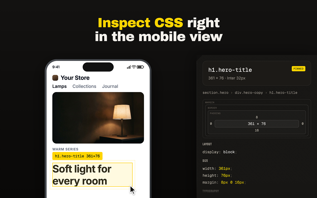
Point at anything. Read its CSS.
The inspector measures the element under your cursor in the live document: computed values, matched media queries, the rules that only apply on hover. It never writes a single node into the page it is reading.
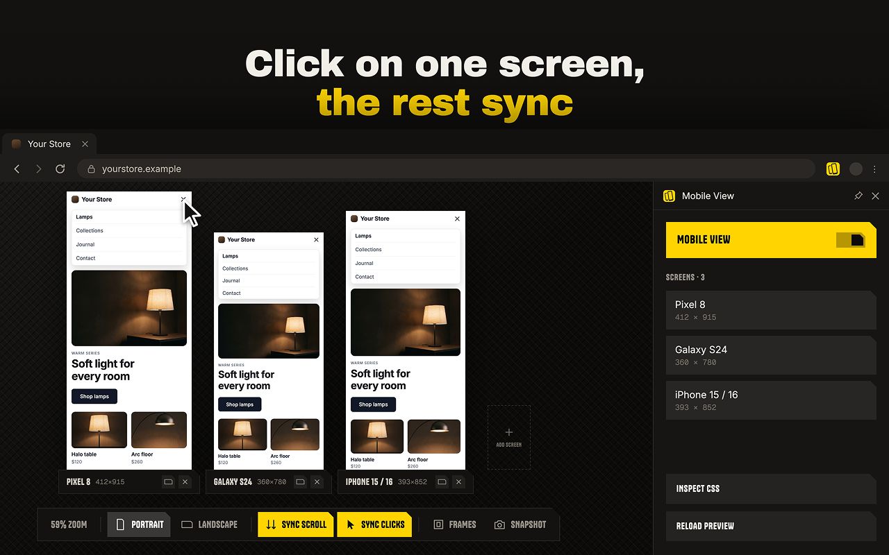
Click once, it lands in all of them.
Turn on shared clicks and a tap in one frame is repeated in the rest. Every element is checked before the click lands, by tag, text, role and label together, and a screen that does not match is skipped rather than guessed at.
Your session comes with it.
The site opens inside the same tab, at the same origin, so cookies stay first-party. Logins hold. Carts hold. An OAuth round trip lands back where it started. There is no second window to manage and no debugger banner across the top of the browser.
Up to eight screens on one tab.
Pick from the catalogue of real handsets or type a width of your own. Portrait, landscape, shared scrolling, the frames on or off: everything sits on the bar under the screens, where the screens are.